How Timeless Typography Builds Instant Brand Equity
Key Takeaways
Flashy web design trends—like aggressive animations and chaotic color gradients—dilute brand authority and rapidly age your platform.
Truly luxurious, high-end digital spaces rely on quiet, classical typography structures to build an immediate sense of legacy.
Editorial-style layouts establish deep trust by prioritizing a strict visual grid and highly intentional font pairings.
Generous, structured breathing room is not "wasted" space; it is a deliberate design choice that signals operational confidence.
Visual restraint is the ultimate differentiator in a noisy digital landscape, shifting your website from transactional to timeless.
The modern internet is incredibly loud.
As digital barriers to entry have plummeted, websites have entered a visual arms race. Landing pages are frequently dominated by aggressive scroll animations, chaotic gradient backdrops, overlapping text blocks, and neon elements competing for a fraction of a second of your attention.
The underlying logic is based on panic: If we don't keep things constantly moving, flashing, and sliding, the visitor will lose interest and leave.
But if you look at the digital flagships of the world's most enduring luxury fashion houses, elite consulting firms, and legacy publications, you will observe a completely different operational philosophy.
You won't find aggressive, sliding animations or heavy visual gimmicks. Instead, you are met with quiet, classical layout frameworks, strict alignment, and a profound reliance on beautiful, restrained typography.
These brands understand a fundamental truth of human psychology: Noise seeks attention, but restraint commands respect. When your digital home relies on flashing trends to keep people engaged, it compromises its long-term brand equity. True digital authority is established not by shouting, but by cultivating a timeless, editorial-grade visual legacy.
The Architecture of the Editorial Digital Space
An "editorial" design approach is inspired by the structured, deeply intentional world of high-end print publishing. It is a style that favors permanence over novelty.
When a brand adopts an editorial layout online, it immediately sets itself apart from the sea of generic, template-driven business sites. This premium aesthetic relies on three foundational visual pillars:
1. Intentional Font Pairings (The Classic Serif & Clean Sans-Serif)
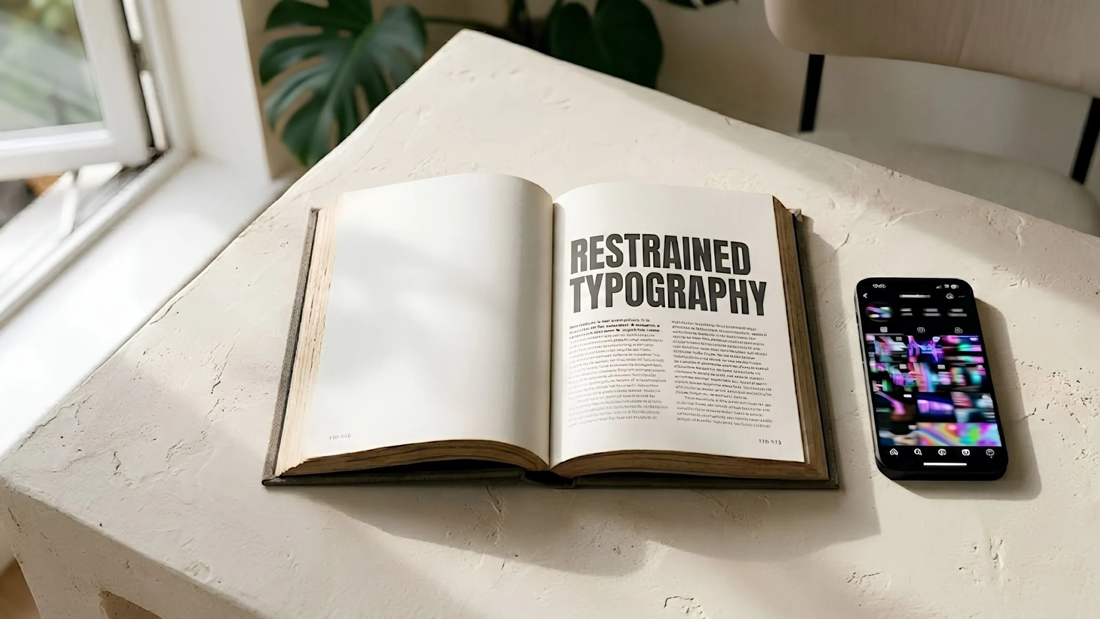
The core of editorial design lies in classical contrast. High-end platforms frequently pair an elegant, high-contrast serif font for primary headings with a highly legible, minimalist sans-serif for body text. The serif header establishes a sense of history, craft, and intellectual depth, while the clean body text ensures your operational details are effortlessly readable.
2. The Uncompromising Grid Alignment
An editorial layout is anchored by a rigorous underlying grid. Every line of text, image border, and button block is precisely aligned to a invisible, structured axis. This invisible discipline is highly satisfying to the human eye. It creates an subconscious feeling of order, stability, and attention to detail—qualities that premium clients directly associate with your business operations.
3. Generous Proportional Padding
In editorial layout design, breathing room is a deliberate design asset. Giving your copy wide, generous margins allows individual paragraphs to read like independent works of art. It slows down the user's scroll speed, encouraging them to actually digest your words rather than quickly skim past them.
The Strategic Value of Brand Trust
Opting for visual restraint over digital trends is not simply an aesthetic preference; it is a highly calculated business decision.
Flashing web trends have a incredibly short shelf life. What feels cutting-edge today will look dated, clunky, and exhausting by next season, forcing you into a constant, expensive cycle of website redesigns.
Restrained typography and classical proportions, however, are immune to the passage of time.
When your digital storefront is built on timeless design principles, it signals to your market that your business is not a passing trend. It establishes an immediate foundation of brand trust. It tells a sophisticated buyer that your ideas are mature, your execution is precise, and your brand is built to endure.
FAQs
Does an editorial layout mean my website has to look boring or completely plain?
Not at all. Restraint is not the absence of design; it is the mastery of it. An editorial layout achieves its dynamic energy through scale, contrast, and exceptional imagery rather than animations. A massive, elegantly styled headline paired with a single, stunning, high-resolution photograph is infinitely more striking and memorable than a page covered in moving graphics.
How do I choose the right serif and sans-serif fonts for my brand?
Look for timeless typefaces with excellent historical roots. Classic serifs like Garamond, Caslon, or modern editorial display serifs pair beautifully with highly clean, geometric sans-serifs like Inter or Helvetica. The key is to avoid "trendy" or overly decorative fonts that are difficult to read and will quickly feel outdated.
Is an editorial-style website layout mobile-friendly?
Absolutely. In fact, a clean, grid-aligned layout translates beautifully to mobile screens. Because editorial design relies on simple, structured column frameworks and elegant font sizing rather than complex, overlapping animation scripts, mobile pages load faster, look incredibly sharp, and are highly accessible to your visitors.

Final thoughts
Your website is the definitive showcase of your brand's standards. It is the visual container that holds your methodology, your messaging, and your hard-earned authority.
When you step off the trend treadmill and embrace the quiet, intentional power of editorial design, your platform transforms. You stop fighting for cheap, fleeting clicks in a noisy market and begin building a timeless digital legacy that naturally attracts, engages, and converts your ideal audience.
What to do next
Is your online platform built to outlast the trends, or is it currently weighed down by digital clutter?
Take an objective look at your site’s visual layout today to see if your design is truly reflecting your operational maturity.
→ Download our Free Web Design Checklist to evaluate your site’s typography hierarchy, clean up your grid alignment, and optimize your overall layout for a premium user experience.
If you want an advanced, expert-trained companion to help you refine your visual strategy, select timeless brand elements, and elevate your website communication, we have built the ultimate tool.
→ Interact with The Brand Clarity Coach AI to seamlessly organize your positioning rules, sharpen your core design rules, and elevate your brand parameters 24/7 before our September 2026 website cohort officially begins.
This article was written with the help of The Brand Clarity Coach — an AI assistant created by Teresanne O’Reilly to help business owners and marketers define their brand strategy, sharpen their message, and create content that connects with their ideal customers.
Use The Brand Clarity Coach in your own business. Get instant lifetime access here for just €89.
You Might Also Like