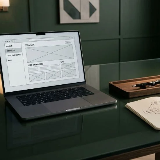
Why Flawed Mobile Design Costs You Premium Clients
Key Takeaways
Visual design creates initial interest, not conversion. A stunning brand identity captures attention, but strategic message architecture closes the deal.
Aesthetics without structure act as expensive digital art. Without clear user flows and intentional positioning, an attractive website fails to drive business growth.
High-ticket decisions rely on clarity. Discerning clients require clear proof of value, structured outcomes, and frictionless intake paths—not just curated visuals.
Restraint elevates perceived brand value. Strategic visual balance, intentional white space, and clear typography build authority faster than decorative visual clutter.
Conversion architecture completes the platform. Pairing editorial aesthetics with a clear user journey turns casual site visitors into high-value inquiries.
Many luxury lifestyle brands, creative agencies, and high-end consultants make a costly mistake: assuming that a striking visual identity is all it takes to attract premium clients.
They invest in elevated typography, editorial color palettes, and custom photography. Yet, when their new platform goes live, inquiries remain sluggish.
The issue isn't that the design lacks beauty. The issue is that visual aesthetics alone cannot do the heavy lifting of strategic sales.
Aesthetically pleasing design creates immediate visual appeal, but without clear brand positioning, strategic narrative structure, and deliberate conversion architecture, your digital storefront is merely expensive online art.
High-value clients do not make investment decisions based on color palettes alone—they buy clarity, trust, and proven strategic direction.
The Limitations of Purely Aesthetic Design
When web design focuses exclusively on visual style while neglecting user psychology, three critical conversion flaws emerge:
Vague Value Propositions: Swapping clear, authoritative messaging for abstract marketing phrases leaves visitors uncertain about what you actually deliver.
Passive Conversion Paths: Treating a website as a static portfolio or photo gallery assumes the client will figure out how to hire you on their own.
Lack of Strategic Context: Displaying finished work without explaining the underlying problem, strategy, and business outcome fails to justify premium pricing.
A beautiful design might encourage someone to admire your website, but it won't convince them to submit an inquiry.
Uniting Editorial Design with Conversion Architecture
To command authority and drive high-ticket sales, your visual identity must work in total harmony with your strategic platform architecture.
Here is how strategy-first brands turn visual appeal into measurable inquiry momentum:
1. Lead with Clear, Uncompromising Messaging
Your core proposition should be obvious the second a prospect lands on your page. Bold, restrained typography should present your primary offering and target audience without unnecessary marketing jargon.
2. Contextualize Every Visual Asset
Case studies and project showcases should tell a complete story. Pair high-resolution imagery with structured narrative details that outline the client's initial challenge, your strategic intervention, and the final value delivered.
3. Engineer a Frictionless Inquiry Journey
Guide visitors toward a single, obvious next step. Whether through a curated intake form or a direct application portal, your call to action should feel like a natural, elevated extension of your brand story.
Strategy Transforms Design into Enterprise Value
Bespoke visuals catch the eye, but strategy-first architecture secures the client.
When you combine editorial design with clear positioning and intentional conversion paths, your digital home stops being a passive display and becomes an engine for sustainable authority.
FAQs
Does focusing on conversion architecture ruin the luxury look of a website?
Not at all. In fact, true luxury design relies on functional clarity and respect for the user's time. Clear conversion paths, bold typography, and generous negative space elevate your aesthetic rather than compromise it.
What is the biggest sign that a website relies too much on aesthetics?
When a site looks incredible at a glance, but a visitor cannot easily determine within five seconds what the business does, who it serves, or how to initiate a project.
How do I balance brand storytelling with direct calls to action?
Integrate them naturally. Use your narrative copy to establish authority and trust throughout the page, then place clear, restrained inquiry buttons at logical decision points along the journey.

Final thoughts
Visual elegance opens the door, but strategic clarity closes the deal.
By pairing your brand's editorial aesthetic with intentional conversion architecture, you eliminate visual noise and make it effortless for high-value prospects to connect with your enterprise.
What to do next
Ready to evaluate whether your digital home is built to convert high-ticket prospects or just look pretty?
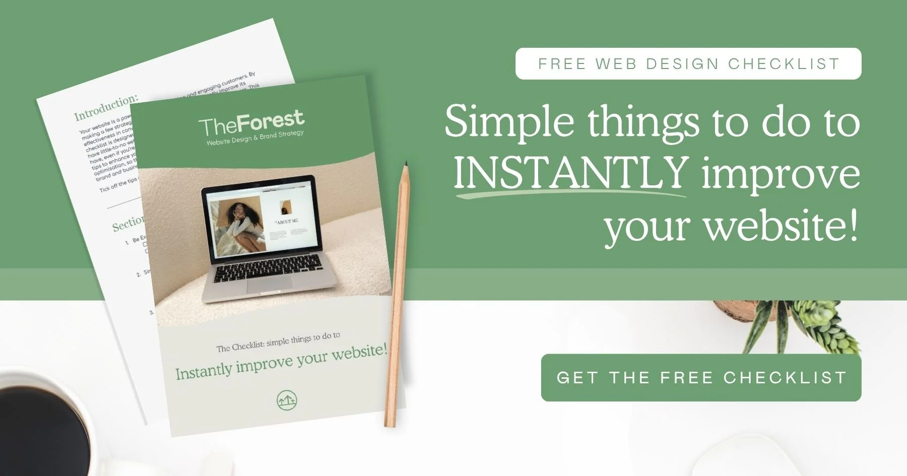
→ Download our Free Web Design Checklist to audit your brand positioning, refine your messaging strategy, and align your platform for long-term growth.
If you want an expert partner to help you build a high-converting digital platform that combines strategy with editorial design, we have built the ultimate tool.
→ Access The Brand Clarity Coach AI to refine your brand messaging, structure your communication strategy, and elevate your platform parameters 24/7—then get in touch with us to discuss your web design project.
This article was written with the help of The Brand Clarity Coach — an AI assistant created by Teresanne O’Reilly to help business owners and marketers define their brand strategy, sharpen their message, and create content that connects with their ideal customers.
Use The Brand Clarity Coach in your own business. Get instant lifetime access here for just €89.
You Might Also Like