How Too Many Options Kill Your Website’s Conversion Rate
Key Takeaways
Offering too many choices on your website triggers decision paralysis, causing high-intent prospects to hesitate and leave without taking action.
Hick’s Law proves that as the number and complexity of options increase, the time it takes to make a decision grows logarithmically.
Designing a single, undeniable "Primary Path" through your digital storefront guides visitors effortlessly from interest to inquiry.
Streamlining your service tiers and calls-to-action signals supreme confidence, positioning your brand as a clear, decisive market authority.
Simplifying your user experience reduces cognitive load, resulting in higher conversion rates and far better client alignment.
Imagine walking into an artisanal bakery that offers just two signature pastries, baked to perfection. You order instantly, confident in your choice. Now imagine walking into a mega-diner with a twenty-page laminated menu packed with hundreds of competing items. You stare at the options, feel a subtle wave of fatigue, and worry about making the wrong decision.
This psychological phenomenon—known as the Paradox of Choice—unfolds on service and lifestyle websites every single day.
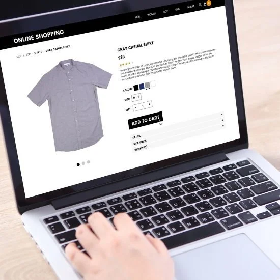
When a prospective client arrives on your homepage, they are looking for a clear, trusted guide to solve a specific problem. But if they are met with five different service tiers, three competing lead magnets, floating chat widgets, and multiple call-to-action buttons scattered across the screen, their brain experiences immediate cognitive overload.
Instead of choosing one option, they choose the easiest path available: closing the tab.
Understanding Hick’s Law in Web Architecture
In user experience (UX) design, this behavioral bottleneck is governed by Hick’s Law (or the Hick-Hyman Law). Formulated by psychologists William Edmund Hick and Ray Hyman, the principle states that the time it takes for a person to make a decision increases logarithmically as the number of choices increases.
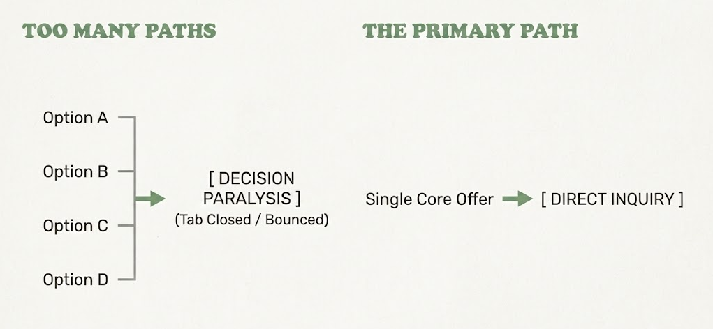
When applied to your digital storefront, the implications of Hick's Law are stark:
More Choices = Higher Anxiety: Presenting multiple competing offers forces the visitor to weigh trade-offs and evaluate complex differences on their own.
Diluted Value Perception: Having endless variations of your services can subtly signal a lack of focus, making your brand look like a generalist rather than an elite specialist.
Loss of Momentum: Every additional button, link, or secondary pop-up creates a micro-friction point that slows down the user's natural journey toward contacting you.
Designing the "Primary Path" Through Your Platform
To transform your website from a cluttered directory into a high-converting digital narrative, you must curate a single, streamlined journey. This is known as engineering the Primary Path.
Here is how to apply Hick’s Law to your web strategy:
1. Consolidate Your Offer Architecture
Resist the urge to display every custom variation of what you do. Group your services into 1 to 3 distinct, clear packages or a single signature engagement. If a client needs a custom scope, let that conversation happen after they enter your strategic funnel—not on the main sales page.
2. Establish One Primary Call to Action (CTA)
Every key page on your site should have a single, undisputed goal. Whether it is "Book a Discovery Call," "Inquire for Availability," or "Apply to Work Together," make that primary button visually dominant. Secondary actions (like reading a blog post or downloading a guide) should be subtle and visually subordinate.
3. Eliminate Visual and Structural Distractions
Audit your navigation menu and page footers. Remove redundant links, competing banner offers, and unnecessary widgets that pull attention away from your primary narrative. Give your core messaging generous negative space so the next logical step stands out with absolute clarity.
FAQs
Does limiting choices mean I will turn away potential clients who want something else?
Curating your options actually attracts higher-caliber clients. When you present a clear, focused signature offer, you signal absolute authority in your niche. Discerning clients prefer working with an expert who prescribes the exact solution rather than a vendor who asks them to build their own package.
What if I offer multiple services across different industries?
If you serve distinct audiences, use your top navigation or an initial landing gate to separate those paths immediately. Once a visitor selects their category, keep their journey focused exclusively on that specific solution without cross-promoting unrelated services.
Can I still offer a free resource or lead magnet on my homepage?
Yes, but place it strategically. Your primary service inquiry should remain the dominant hero action. A lead magnet can serve as an alternative "soft entrance" lower down the page for visitors who aren't quite ready to buy—provided it doesn't compete with your main call to action.

Final thoughts
Simplicity is not the absence of value; it is the ultimate expression of confidence.
By applying Hick’s Law and removing unnecessary choices from your website, you remove the friction between curiosity and conversion. You create a calm, authoritative user experience that respects your client's attention, eliminates decision fatigue, and guides them effortlessly into your world.
What to do next
Take a critical look at your website's homepage today. Count how many different buttons, links, and offer tiers a visitor sees before scrolling. Are you guiding them down a clear, intentional path, or asking them to figure it out on their own?
→ Download our Free Web Design Checklist to audit your site's navigation structure, evaluate your visual hierarchy, and streamline your core conversion paths.
If you want an expert partner to help you refine your offer suite, eliminate operational friction, and build an authoritative, strategy-first digital storefront, we are here to support your vision.
→ Access The Brand Clarity Coach AI to map out your core offers, refine your call-to-action strategy, and elevate your website architecture 24/7—then get in touch with us to discuss your web design project.
This article was written with the help of The Brand Clarity Coach — an AI assistant created by Teresanne O’Reilly to help business owners and marketers define their brand strategy, sharpen their message, and create content that connects with their ideal customers.
Use The Brand Clarity Coach in your own business. Get instant lifetime access here for just €89.
You Might Also Like