Key Takeaways
Treating copy and design as separate phases results in disjointed, confusing user experiences that dilute brand authority.
True editorial web design uses copy as structural scaffolding—letting narrative hierarchy dictate layout choices rather than forcing words into fixed templates.
Clear visual hierarchy guides the eye, allowing visitors to instantly scan, digest, and understand your core brand value.
Strategic typography pairings and grid alignments give your messaging the weight, dignity, and breathing room it deserves.
When messaging flow and visual structure work in complete harmony, passive readers effortlessly transform into high-intent clients.
Imagine walking into a high-end luxury boutique. The architecture is pristine—polished stone floors, immaculate lighting, and soaring ceilings. But as you step closer to inspect a product, there are no details, no context, and the store staff speaks in fragmented, confusing whispers that don't match the space at all.
The initial visual grandeur collapses instantly.
This exact disconnect happens on thousands of luxury and lifestyle websites every day. A business owner invests time and resources into building a gorgeous digital storefront, but leaves the messaging as an afterthought—dropping generic placeholder text into a rigid visual template at the very last minute.
The result is a platform that looks stunning in a screenshot, but fails completely in practice.
When copy and design are treated as isolated silos, the user experience becomes fragmented. A truly high-performing website does not use design to hold copy; it uses copy as the structural scaffolding of the design itself. To build a platform that commands respect and drives long-term conversion, your narrative hierarchy and your visual layout must be engineered together from day one.

The Flaw of the "Container-First" Approach
In traditional, template-driven web design, the process usually works backward: an aesthetic framework is built first, and then text is squeezed into pre-assigned boxes.
This container-first approach creates immediate structural friction:
Distorted Message Hierarchy: Important strategic statements are cut short because a template box is too small, or crucial value propositions are padded with fluff to fill extra space.
Cognitive Fatigue: When copy doesn't align with the visual rhythm of the page, the user's brain has to work twice as hard to parse what you actually do.
Surface-Level Engagement: A site might capture momentary aesthetic admiration, but it fails to build deep emotional trust or guide the visitor toward a meaningful action.
Engineering Copy as Architectural Scaffolding
When you adopt an editorial, strategy-first mindset, copy and layout are fused into a single, cohesive system. Your narrative establishes the baseline grid, and the visual elements exist to amplify the voice of your brand.
Here is how copy functions as structure in an editorial digital space:
1. Narrative Anchors (The Header Grid)
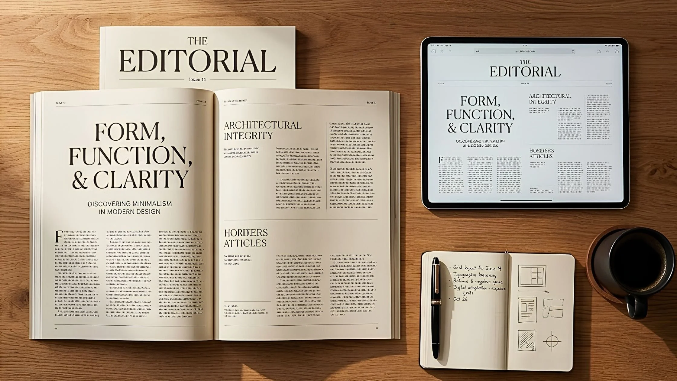
Your primary headlines act as the architectural pillars of your layout. In high-end editorial design, a bold, beautifully paired serif headline sets the structural tone of a section. It gives the reader an immediate, clear mental anchor before their eyes descend into the supporting copy.
2. Cadence and Column Width
Long lines of text that stretch across an entire wide monitor create immense eye strain. An editorial framework applies strict column widths, giving copy generous side margins. This intentional constraint creates a comfortable, rhythmic reading pace that mimics the effortless flow of a luxury magazine feature.
3. Visual Pacing through Scannable Sub-Structures
Not every visitor reads word-for-word on their first visit. By using clear subheadings, structured pull-quotes, and generous line spacing, your messaging creates an intuitive visual map. A visitor can skim the page in ten seconds, grasp your core business transformation, and feel invited to dive deeper into the prose.
The Bridge from Curiosity to Conversion
When your copy serves as the blueprint for your design layout, the visitor experience shifts from passive browsing to active engagement.
Instead of being distracted by random visual flourishes or lost in dense blocks of unformatted text, the user is seamlessly guided down the page. Every scroll feels natural. Every headline answers a subtle question. Every section builds quiet confidence in your authority.
By ensuring that your visual layout exists to serve your strategic message, your website stops being a passive visual brochure and transforms into an effortless, high-converting digital narrative.
FAQs
Should I write all my website copy before starting the design process?
Ideally, yes—or at least have a clear messaging architecture outlined. Writing your copy or working with a strategist first allows the designer to build custom layout structures tailored around your exact story, rather than forcing your messaging into pre-made visual blocks.
How do I balance high-end editorial copy with SEO requirements?
Editorial flow and search engine optimization are actually natural allies. Search engines favor clear headline hierarchies (H1, H2, H3 tags), highly readable content, and low bounce rates. When your site is structurally easy for humans to read and digest, visitors stay longer—which directly signals authority to search engines.
What is the most common mistake brands make with web copy and layout?
The most common mistake is crowding the page out of fear that the visitor will miss something. When you try to say everything at once in a dense block of text, you end up communicating nothing. Generous spacing around concise, powerful messaging will always outperform cluttered text walls.

Final thoughts
Your website is the single most important narrative space for your business. It is where your vision, your offerings, and your high-end aesthetic meet your ideal client.
When you abandon the template mindset and allow your copy to serve as the structural backbone of your platform, your digital presence elevates. You create an intuitive, editorial flow that honors your visitor's time, establishes your market authority, and turns casual curiosity into lasting client partnerships.
What to do next
Take a fresh, objective look at your homepage layout today. Is your design actively elevating your message, or is your copy fighting against a rigid visual framework?
→ Download our Free Web Design Checklist to audit your narrative hierarchy, review your visual spacing, and evaluate your core user touchpoints.
If you want a strategic, expert-trained partner to help you map out your core brand messaging and align it with a pristine digital architecture, we have developed the ultimate tool.
→ Access The Brand Clarity Coach AI to refine your brand positioning, structure your communication strategy, and elevate your platform parameters 24/7 before our September 2026 website cohort officially begins.
This article was written with the help of The Brand Clarity Coach — an AI assistant created by Teresanne O’Reilly to help business owners and marketers define their brand strategy, sharpen their message, and create content that connects with their ideal customers.
Use The Brand Clarity Coach in your own business. Get instant lifetime access here for just €89.
You Might Also Like